
Wales Comic Con was founded in 2008 from humble beginnings with just 150 attendees for the first event in a university sports hall in Wrexham.
The event has grown exponentially in popularity over the years and now welcomes on average 30,000 visitors annually.
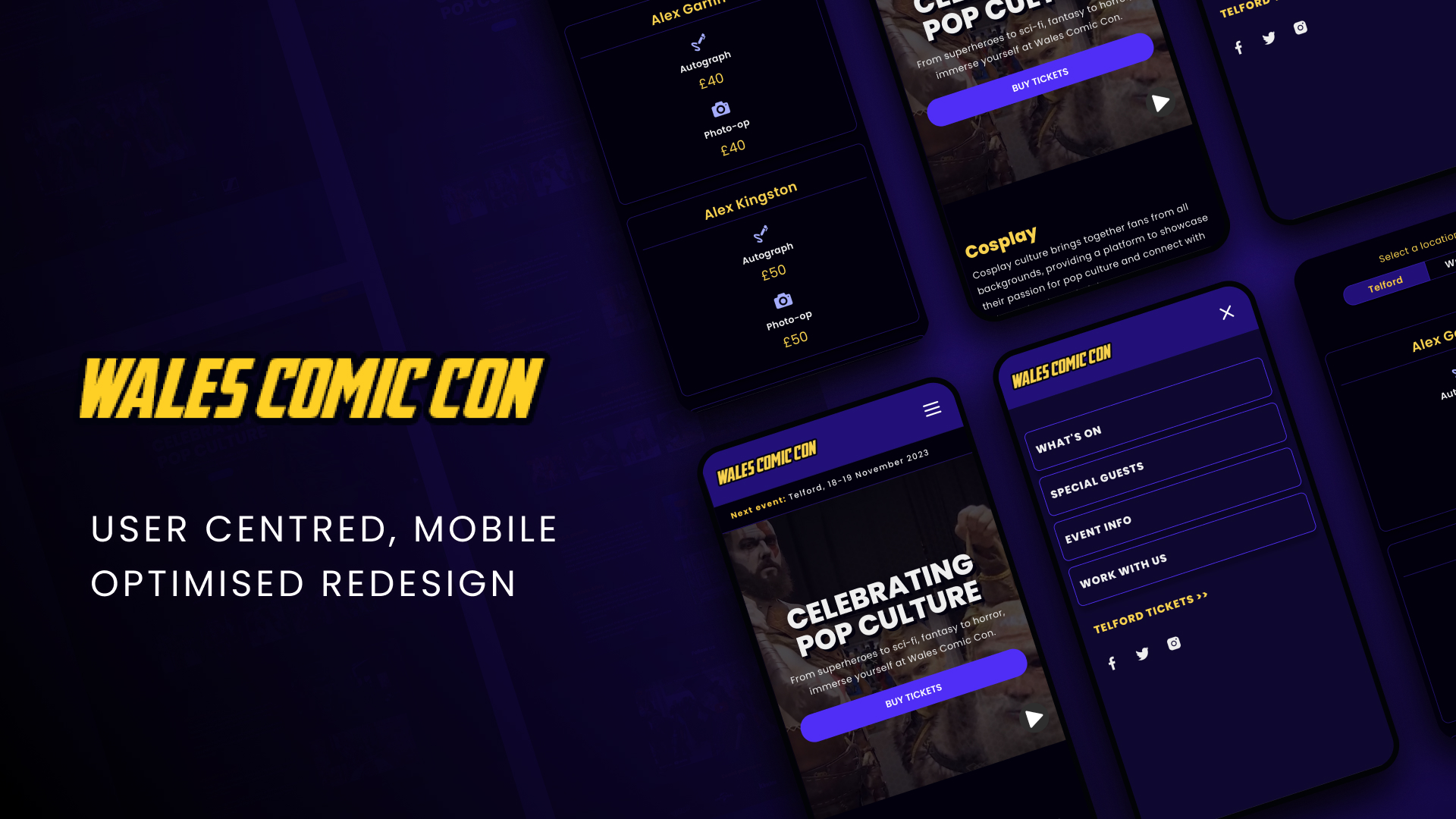
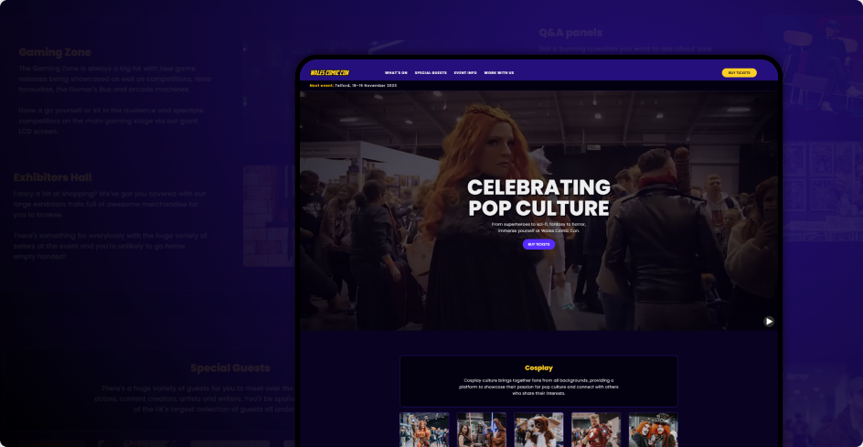
The website was built in 2015 using Webflow (previously WordPress website) with an average visitor count of 28,000 per month. While it was overdue for a UI makeover, it quickly became clear that a UX overhaul was required too.
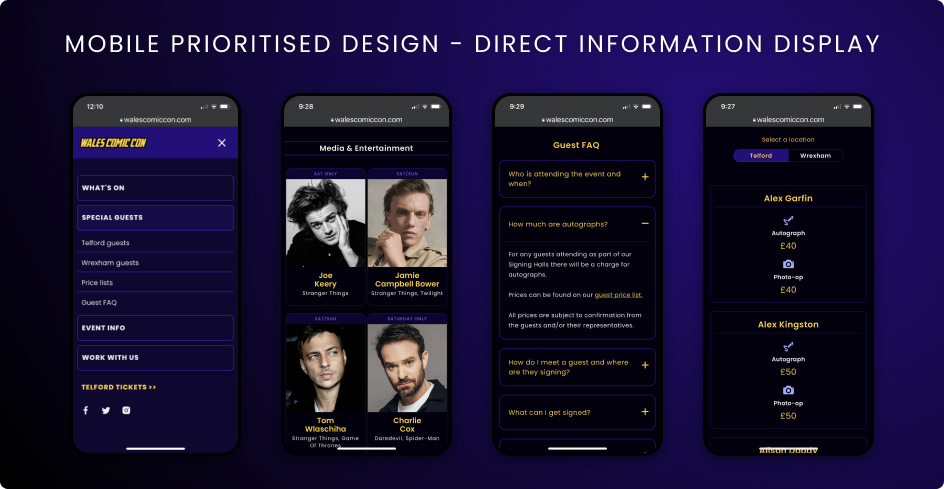
The analytics showed that 80% of website traffic are mobile device users, and with the previous design not being mobile optimised, this posed a lot of unnecessary challenges for customers looking for information and tickets to the event.
With Webflow being a relatively new platform when building the original site, the options available today didn't exist at the time, or had not been fully utilised, making for a rather complicated and messy update process for editors.
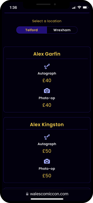
80% of users having a poor mobile experience
Mobile experience broken, with the navigation not in the correct place, images clipped off and needlessly long pages that were originally made for desktop only. 80% of users access via mobile devices.
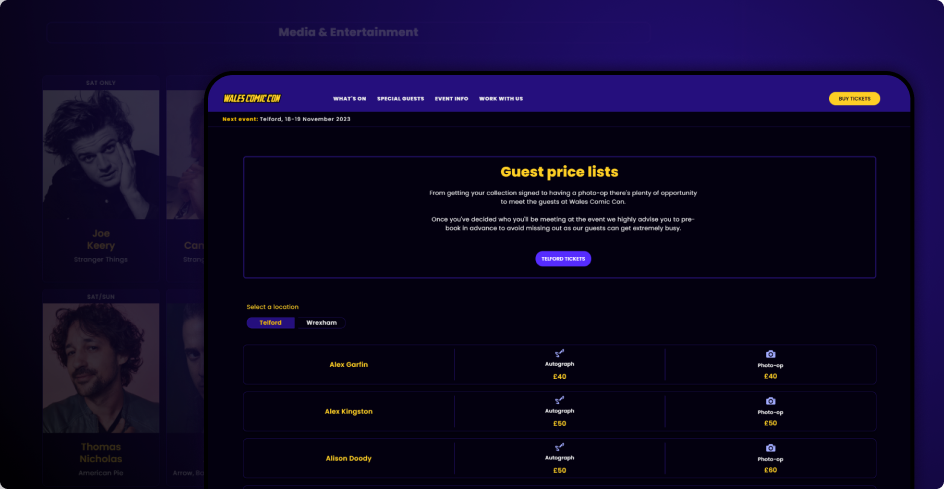
Important information unavailable
Essential information was not easy to find, or completely unavailable making users resort to the Facebook page for the info, where it was easily missed. Ultimately it led to the user having to do too much research to find basic information that should be easily accessible on the website in the first place.
Conflicting information & broken/outdated links
Because of the way that the original site was built, elements needed to be manually updated individually, resulting in certain information not being changed. There were also spelling errors as well as broken links.
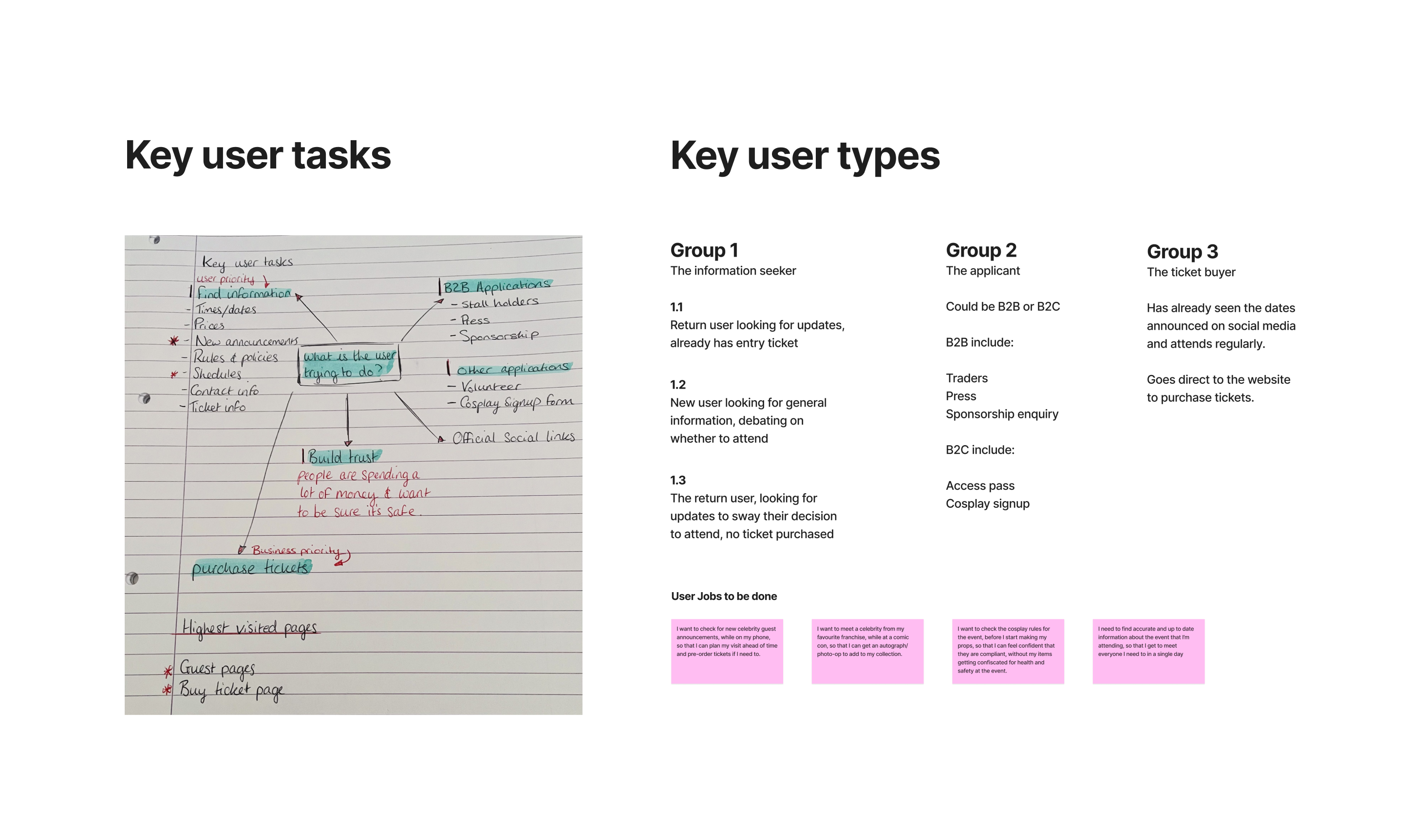
It quickly became clear through research that more work needed to be done to improve the information delivery via the website. Armed with the newly defined problem statement it was time to get to work!
This resulted in the need to reflect on the information architecture of the site, and looking into the back-end content management process for editors of the site to ensure mistakes didn't happen as easily in the future.
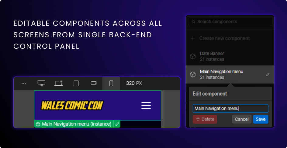
1. A new CMS system was created with logic linking to multiple sections of the website via one single editable dashboard with instructions and required fields for content editors.
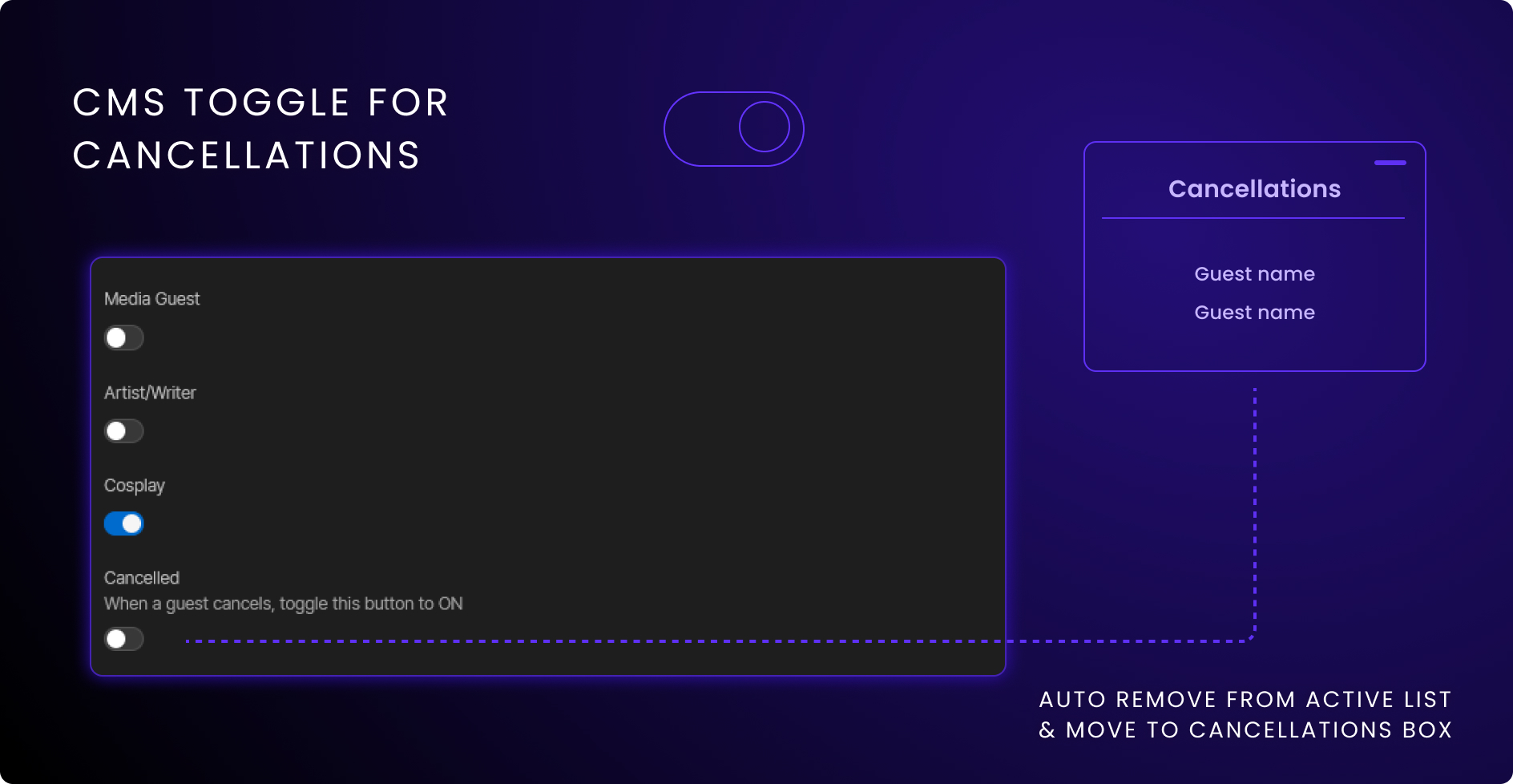
2. Cancellations were kept up to date with a toggle feature added into the CMS panel that when activated would automatically remove the cancelled guest from the active list and add the name into the cancellations box.
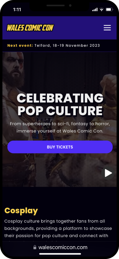
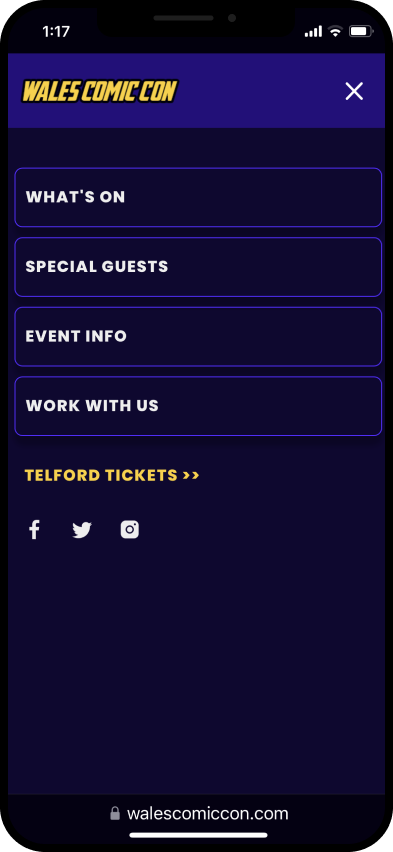
3. Adapted design for mobile users based on the data that 80% of users were from mobile devices. The navigation was completely overhauled and designed for mobile first along with all screens being adapted.
4. Components added for easy editing across pages to create a more streamlined approach to changing information between events. This greatly improved the consistency across the site and reduced issues such as outdated links and buttons being left up.
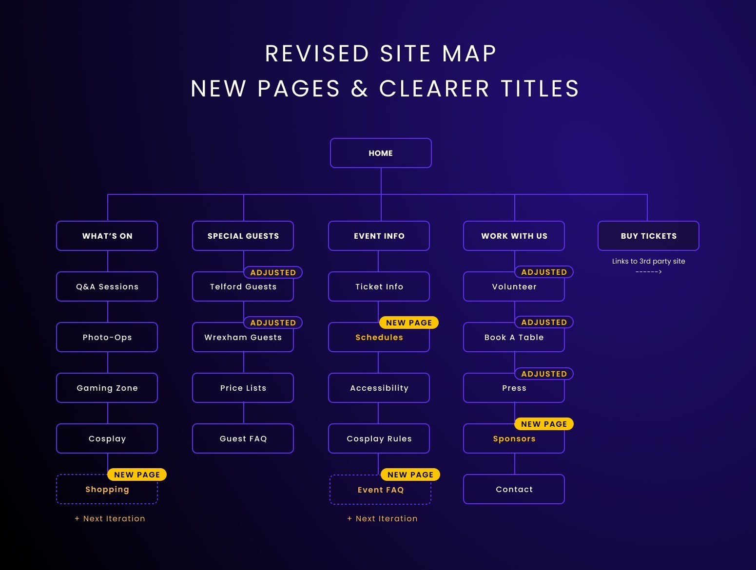
5. Adjusted site map:
Additional pages were added based on user requests and research along with renamed navigation elements using more accurate and descriptive titles.
A general landing page redirecting to other specific event pages was considered, or rather, using a "hub and spoke" dashboard model. With different colour schemes, branding, and naming conventions to depict that it's a different event site.
Due to time constraints and factors such as potentially causing confusion to customers, this direction wasn't taken. The combined approach while not ideal, was considered the best approach for this iteration. The main goal was to focus on and fix the more immediate issues first.
Filters and search functions while great quality of life features for the website, they were not feasible in the short time span avalable. The additional functionality would have extended the launch date considerably, and has been added to the backlog for future implementation.
Some "nice to have" pages were added to the backlog to apply in future iterations.
Due to a lot of compromises needing to be made in the initial relaunch, some features and research will be done at a later date. These include:
1. Adding a filter/sort function for celebrity guest list pages.
2. A search/filter function on the pricing page to allow users to find exactly who they're looking for, without having to scroll and find alphabetically/manually.
3. User test a sticky navigation bar vs a back-to-top button on lengthy pages.
4. Additional navigation elements and pages added for planning: Where to stay, eat and drink etc.
5. Internal design system and support documents for editors.